color isn't decoration. it's a direct line to emotion and meaning. in motion design, where you control timing and transition, color becomes an even more powerful tool for guiding viewer response.
beyond basic associations
everyone knows red means danger or passion, blue suggests calm or trust. these baseline associations exist, but treating them as fixed rules limits your options and leads to predictable work.
context changes meaning. red in a medical animation reads differently than red in a sports brand video. the surrounding colors, the pace of motion, the sound design, all of these modify how viewers interpret any given color.
cultural context matters too. color symbolism shifts across cultures. white suggests purity in western contexts but mourning in some eastern cultures. if you're working internationally, research your audience's color associations rather than assuming your defaults are universal.
contrast drives attention
your eye goes to contrast first. high contrast between elements creates hierarchy and directs focus. in motion work, you can manipulate this dynamically, shifting contrast relationships over time to guide attention through your narrative.
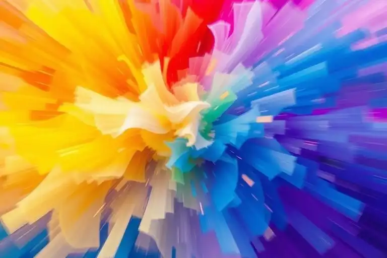
saturation contrast works as powerfully as value contrast. a highly saturated element surrounded by desaturated ones pulls focus just as effectively as a bright element on dark background. this technique keeps your palette sophisticated while maintaining clear visual hierarchy.
color transitions create emotional shifts
static color palettes feel flat in motion work. transitioning color schemes throughout your piece mirrors and reinforces emotional arcs in your story. warm to cool can signal movement from energy to calm. desaturated to saturated can represent transformation or revelation.
the speed of color transition affects perception. gradual shifts feel organic and natural. sudden color changes create emphasis or surprise. neither is inherently better, choose based on the emotional beat you're trying to hit.
harmony vs tension
harmonious color schemes create comfort. analogous colors or monochromatic palettes with controlled value ranges feel cohesive and easy to process. use harmony when you want viewers relaxed and receptive.
complementary colors create visual tension. that tension can be dynamic and energizing or can create unease depending on how you deploy it. tech brands often use complementary schemes to feel innovative and forward-thinking. the same approach in healthcare might feel unstable.
practical application in motion
start with emotional goals, not color choices. what do you want viewers to feel at each moment? map your emotional arc first, then assign color strategies that support those emotional targets.
limit your palette. working with constraint forces more creative solutions than unlimited options. three to five colors is plenty for most projects. more colors means more cognitive load for viewers and more chances for muddled visual communication.
test in context. colors look different in motion than they do in static frames. what feels subtle in a still might disappear when animated. what feels bold in a single frame might overwhelm when held for duration. always preview at intended playback speed.
saturation and energy
high saturation increases perceived energy. fully saturated colors demand attention and create excitement. this works for short durations but becomes exhausting over time. modulate saturation levels based on how long viewers will spend with each segment.
desaturated palettes communicate sophistication and maturity but can feel cold or distant. adding small amounts of saturation to key elements creates focal points while maintaining overall restraint. this approach is particularly effective for corporate or luxury work.
temperature and pacing
warm colors advance, cool colors recede. this spatial quality affects how viewers perceive depth and motion. use warmer colors for elements you want to feel close or immediate. cooler colors work for background or distant elements.
color temperature also affects perceived motion speed. warm colors feel faster and more urgent. cool colors feel slower and more deliberate. you can use this to subtly reinforce pacing without changing actual animation timing.
common mistakes
over-relying on trends kills longevity. that gradient everyone's using this year will date your work next year. base color choices on emotional function rather than what's currently popular, and your work stays relevant longer.
ignoring accessibility limits your audience. ensure sufficient contrast for legibility. test for color blindness compatibility. making your work accessible doesn't mean making it boring, it means making intentional choices that work for more people.
building your system
create color rules for your project upfront. define your palette, specify when and how colors shift, establish hierarchy rules. these constraints don't limit creativity, they focus it and ensure consistency across longer pieces or series.
document your thinking. when you make a color decision, note why. this helps you maintain consistency and helps collaborators understand the system. it also makes revisions faster because you remember the logic behind each choice.
the goal isn't perfect color theory. the goal is deliberate emotional communication. understand the tools, then use them intentionally to support your narrative. color in motion is storytelling, not decoration.